
Castalia House books have often been praised for their covers, by readers as well as authors. In this series of posts about book covers, Castalia House’s Lead Artist, JartStar, explains his philosophy of quality cover design.
What makes a good cover for a book? I hope to shed some light on this difficult question in this first of several articles about cover design. These articles are written for the artists, readers, and authors.
Accuracy
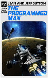
Castalia House has an advantage over the traditional publishing houses in cover design as the authors have a say in the creative process. I cannot speak from direct experience of working for a major publisher, but our authors have expressed their gratitude and even relief in having a say in cover design which they have not experienced before. I believe a large part of this liberation is that our covers can more accurately reflect their vision of the work, not only in specific details, but also in mood. Accuracy is important and authors are frustrated when what appears on their books seems to have little or nothing to do with what they have written. Castalia House estimates perhaps 30 percent of the sales of a book are generated by the cover alone.
 I do freelance work directly for authors outside of Castalia House and it has almost always been a positive experience, but if there is one issue which trips up self-publishing authors it is getting caught up in the minutia of an image and trivial details. Such is the dark abyss of obsessing over trivialities that one will never escape if an author lets minor things consume him. Small and even middling details are going to have to be let go if they don’t add to the image. On the other hand if a character has a specific, small detail, for instance a tattoo, or always wears a certain hat these trademarks are obviously necessary and cannot be left out.
Getting the big things right is the most important part of accuracy on a book cover. The dark elf character cannot be portrayed as a wood elf no matter how wonderful the art. Supergirl cannot be Superboy, and the gun in the villain’s hand better be a gun in the story and not a sword. The scene must have some correlation to what is in the book as the accurately drawn heroine cannot be stalking on rooftops at night if the story is about her trip to the Far East on a train with not a rooftop stroll at night in sight.
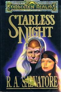 Main characters in a series present a particular challenge as many times it is better not to define the look of a character so precisely in artwork. If a main character is to be illustrated I suggest it should be on the first book they are prominent in as by the third or later book in a series the readers will have countless ways of envisioning the character and possibly be jarred by a sudden portrayal since readers remember different details about characters. I can speak from experience having seen a portrait of a character, think it was incorrect, but then check the source and find out my imagined version is very wrong. The matter is further complicated when a new artist has the task of following a previous artist and either tries to unsuccessfully portray the character based upon an earlier work, or completely redesigns the character from the previous version. A good example is the R.A. Salvatore character Drizzt, which was first illustrated by Larry Elmore on THE CRYSTAL SHARD, and then Drizzt looks like an old man when the talented Robh Ruppel illustrated a few covers. I didn’t even recognize Drizzt and I wondered who the old dark elf on the cover was when I first saw the book. Incidentally I do like Catti-brie on the Ruppel covers and she looks more like I had envisioned her. The later artists for the Drizzt series have closely followed Elmore’s original look and there is a consistency now going back over 20 years.
While outside of the scope of this article the final piece of the puzzle is making sure the mood and tone of the cover is accurate for the genre of the book. Bright colors with blue skies and green grass would hardly make sense for a horror novel. Lighting is very important on a cover and so there will almost always be false lighting on the subject matter to increase the drama and tension of a scene. Even a romance cover generally will have unrealistic lighting given the background versus characters for good reason; the cover needs to accurately convey the emotion of the genre for the book.
Hello,
If I have sent this e-mail to the wrong person I
wonder if you would be so kind and foreword
it to the right person, if you know who that
would be. Thanks!
I’m a professional Science Fiction and Fantasy
Book Cover Illustrator and I’m interested in doing
book cover illustrations for you.
I wonder if you could possibly be able to tell me
the name and e-mail address of the person I can
contact t show my website portfolio to?
Thanks,
Charles Bernard
Book Cover Illustrator
2554 Federal Avenue
Alliance, OH 44601
USA