
 Michael Whelan (b. 1950) is probably the most successful artist I will cover in this series. If you bought science fiction or fantasy books in the 1980s or 90s, you have seen his work.
His website has this say about his story:
“A graduate of San Jose University with a BA in Painting and a President’s Scholar, Michael went on to attend the Art Center College of Design also in California, but he dropped out to accept his first book cover assignment. He soon became known for his dedication to bringing an author’s words to life and Whelan covers dominated the science fiction and fantasy field throughout the 1980s and 90s. He was largely responsible for the realistic style of genre covers of that era.”
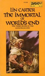
His first cover was for the German publication in 1975 for a Henry Kuttner reprint. Whelan was yet again, one of those artists used by Donald Wollheim at D.A.W. Books. His first paperback for D.A.W. was The Enchantress of World’s End (1975) by Lin Carter. He also did the cover for The Year’s Best Horror II (1975), an association he would maintain throughout the series life.
Whelan produced covers for Ace reprints of Marion Zimmer Bradley Breen’s “Darkover” books in the middle 1970s. He painted the cover for C. J. Cherryh’s first novel The Gate of Ivrel (D.A.W. Books, 1976).
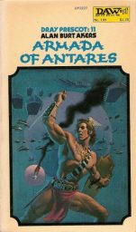
Kenneth Bulmer writing as “Alan Burt Akers” in a very long series of sword and planet novels had some great covers. Michael Whelan produced three covers for that series.
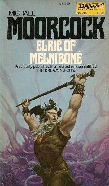
It was in 1976 when D.A.W. books reprinted Michael Moorcock’s “Elric” stories in a unified series. Whelan did all the covers. They are iconic for the character even if Whelan painted Elric too muscular. Fans of the series have mentioned these are their favorite covers.
Ace Books was not going to lose out. One of his first works for that publisher was for Fritz Leiber’s 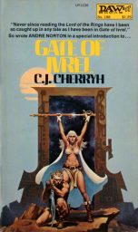 Swords and Ice Magic (1977). More than one person has said to me that his depiction of Fafhrd and the Gray Mouser was how they thought they looked.
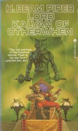
Ace had Whelan produce covers for new editions of H. Beam Piper. Lord Kalvan of Otherwhen is not sword and sorcery but one of the early alternate history science fiction books. The cover certainly has the look of sword and sorcery. Whelan also produced many covers for Poul Anderson paperbacks at this time. Many of my Poul Anderson books have Whelan covers.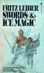
I can remember seeing Anne McCaffrey’s flying dragons on another planet paperbacks at an airport in 1979. They leaped out at you with the colors.
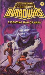
Ballantine/Del Rey lured Michael Whelan to produce covers for new editions of Edgar Rice Burroughs’ Barsoom/John Carter series. Again, these covers attracted your attention and probably played no small part in keeping that series on the bookshelves all through the 1980s.
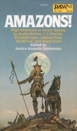
Whelan got to produce a cover for one of the original sword and sorcery anthologies in 1979 – Amazons! The female warrior has a different look with a pseudo-samurai looking armor.
1982, I was in college and Del Rey put out a new set of H. P. Lovecraft paperbacks. These are probably the greatest covers for Lovecraft in paperback ever done. Whelan did those all as one mural. He does have the knack for horror.
Sword and sorcery was winding down as the 1980s proceeded. One of Whelan’s last great sword and sorcery covers was for Michael Shea’s Nifft the Lean (D.A.W. Books, 1982).
Whelan continued to produce a ton of science fiction covers through the 1980s and 1990s with a fantasy cover here and there. He even produced some covers for the Sword and Sorceress series as late as 2002.
There is a forthcoming book, Beyond Science Fiction: The Alternate Realism of Michael Whelan to be released on December 1st. So, Whelan managed to prosper though the decades of changes in illustration.
I always liked his anatomy of the human physique. His human characters were muscular but not steroid giants or grotesque. Realism indeed, in regards to contents of the book. No hippie-dippie psychedelic art here. There are probably some that don’t like his art. I liked his use of color, especially in those earlier years.
You might have forgotten about some of his sword and sorcery work.
For some reason I had always mentally assigned those Lovecraft covers to Wayne Barlowe instead of Michael Whelan. How embarassing!
-
Barlowe is good, but not THAT good. Sort of the Ken Kelly to Whelan’s Frazetta.
Just an absolute titan in SFF art. If Frazetta “made” Conan — which notion I disagree with — then Whelan “made” Elric in the US. His Fafhrd and Gray Mouser painting is pitch-perfect and very accurate to how Leiber described them. I know lots of people who consider Whelan’s Barsoom covers to be THE definitive pictorial vision of ERB’s Red Planet.
It’s a pity that Whelan never did any Merritt covers. He did do a glorious painting of Haggard’s She/Ayesha.
I think his use of color is what grabbed me, but I am one of those who consider his Fafhrd & Gray Mouser and Barsoom covers to be superb images of the authors’ works.
Awesome post as always! I always loved his work, his Elric was always my favorite! I featured much of his art in my “Definitive” blog post series.
I bought the whole series of Barsoom books with Michael Whelan covers for my personal library. He really does understand color theory and how to make an image pop.
“I like his use of color, especially in those early years.”
First time I saw them, I was gobsmacked by how lovely the colors were on the Piper books. The orange scheme for THE COSMIC COMPUTER particularly impressed me.
-
A classic Military SF cover. Good dynamism in that painting as well. Whelan delivers the goods.
It isn’t sword and sorcery, but I have a giant print of his cover art for The Way of Kings up on my wall. He has done some really incredible work.
Whelan’s Barsoom covers really fired my imagination as a kid. His cover for Foundation’s Edge was so good that it made even an Asimov book look like an interesting read.
-
That takes some doing. A testament to Whelan’s talent.
Whelen’s work is always fantastic but if I had to select a single favorite it would be the cover he did for the paperback version of Heinlein’s Friday. I had a hardback copy of the book but that cover tempted me every time I saw it in a bookstore. I finally found a print of it at Dragon*Con back in the ’90s and snapped it up. It now hangs on the wall in my home office, along with several other *ahem* inspirational prints. Whenever my writing bogs down, I spend a minute or two contemplating Friday and her friends. It’s a worthwhile endeavor, even if my writing remains bogged down.
While it’s not Sword & Sorcery, Whelan’s cover for Larry Nivea’s ‘The Integral Trees’ probably captured my imagination more than any other book ever has. It was enough to get me to buy my very own “grown up” sci-fi (I was 12). It blew my mind, or at least the setting did. My favorite book cover ever. Possibly followed by his illustration of C.J. Cherryh’s The Faded Suns omnibus.
And Whelan captured both perfectly. And over the years, whenever I read a book and Whelan painted the cover, I’m blown away by the details he puts in that lets the reader know that he actually did research and/or read the book. He doesn’t just paint something that vaguely corresponds to the story.